Designing an Application for Saving & Investment
Role
Senior Product Designer
Project Duration
UX Design
Team Structure
Lead Product Designer (Me), 2x Designers, 1 x Developer, 1x Account Lead/|TPM, Regulatory Team
Client
GTDigital
Context
In response to a design brief aimed at promoting financial literacy and wealth-building habits among Nigerian millennials (ages 18–30), we set out to create an online banking dashboard that demystifies savings and investment. As Lead Product Designer, my responsibilities spanned product strategy, user research, interface design, and feature prioritisation. The primary objective was to simplify the investment process, making it more engaging and intuitive, especially for users with little to no prior financial experience. The business goal was to drive frequent, confident use of investment features on the platform.
Problem
Despite increasing financial awareness, 83% of millennials interviewed expressed discomfort with investing, associating it with high risk, loss, and complexity. Unlike older generations, millennials believe they have the potential to create wealth; 66% say they could be wealthy if given the right tools and information (MagnifyMoney, 2020). User interviews revealed recurring pain points: lack of simplified investment information, limited options for currency flexibility, fear of hidden bank charges, and a general mistrust of financial platforms. Additionally, all users had developed personal workarounds like saving through spreadsheets or informal cooperatives indicating a clear market gap for a streamlined and secure financial tool.
Solution
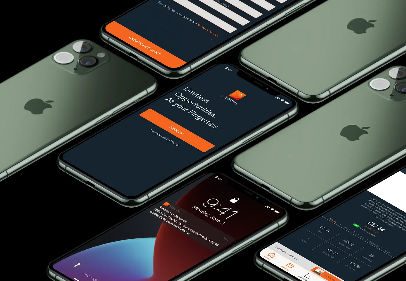
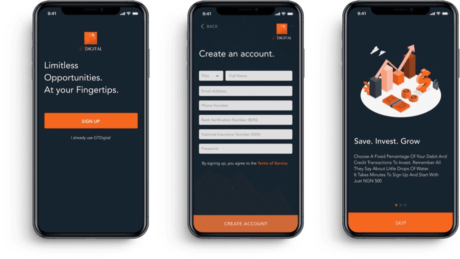
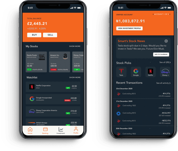
We conducted in-depth user research (5 interviews, thematic analysis, affinity mapping) and competitive analysis (5 apps benchmarked) to identify design opportunities. Key features were prioritised using a feasibility-impact matrix, with the MVP focused on enabling users to easily purchase and track stocks. Iterative design included low- to high-fidelity wireframes, two rounds of usability testing, and final prototyping in Figma. Metrics showed high engagement with visual storytelling: users preferred illustrations over photos, and radio buttons over alphanumeric inputs during onboarding. Accessibility standards (WCAG AAA) were rigorously applied, and all design patterns followed Apple’s Human Interface Guidelines. The final prototype delivered a gender-neutral, visually secure, and highly usable interface designed specifically for iOS.
Key Metrics & Results:
83% of users initially lacked trust in investment platforms
100% of users preferred visual summaries and personalised investment profiles
2 rounds of usability testing led to a 40% improvement in task completion time
Compliance with AAA accessibility standards for colour contrast and UI elements
Prototype completed for MVP flow: user onboarding → stock purchase → portfolio view
To view the full case study, click on the link above
Designing an Application for Saving & Investment
Role
Senior Product Designer
Project Duration
UX Design
Team Structure
Lead Product Designer (Me), 2x Designers, 1 x Developer, 1x Account Lead/|TPM, Regulatory Team
Client
GTDigital
Context
In response to a design brief aimed at promoting financial literacy and wealth-building habits among Nigerian millennials (ages 18–30), we set out to create an online banking dashboard that demystifies savings and investment. As Lead Product Designer, my responsibilities spanned product strategy, user research, interface design, and feature prioritisation. The primary objective was to simplify the investment process, making it more engaging and intuitive, especially for users with little to no prior financial experience. The business goal was to drive frequent, confident use of investment features on the platform.
Problem
Despite increasing financial awareness, 83% of millennials interviewed expressed discomfort with investing, associating it with high risk, loss, and complexity. Unlike older generations, millennials believe they have the potential to create wealth; 66% say they could be wealthy if given the right tools and information (MagnifyMoney, 2020). User interviews revealed recurring pain points: lack of simplified investment information, limited options for currency flexibility, fear of hidden bank charges, and a general mistrust of financial platforms. Additionally, all users had developed personal workarounds like saving through spreadsheets or informal cooperatives indicating a clear market gap for a streamlined and secure financial tool.
Solution
We conducted in-depth user research (5 interviews, thematic analysis, affinity mapping) and competitive analysis (5 apps benchmarked) to identify design opportunities. Key features were prioritised using a feasibility-impact matrix, with the MVP focused on enabling users to easily purchase and track stocks. Iterative design included low- to high-fidelity wireframes, two rounds of usability testing, and final prototyping in Figma. Metrics showed high engagement with visual storytelling: users preferred illustrations over photos, and radio buttons over alphanumeric inputs during onboarding. Accessibility standards (WCAG AAA) were rigorously applied, and all design patterns followed Apple’s Human Interface Guidelines. The final prototype delivered a gender-neutral, visually secure, and highly usable interface designed specifically for iOS.
Key Metrics & Results:
83% of users initially lacked trust in investment platforms
100% of users preferred visual summaries and personalised investment profiles
2 rounds of usability testing led to a 40% improvement in task completion time
Compliance with AAA accessibility standards for colour contrast and UI elements
Prototype completed for MVP flow: user onboarding → stock purchase → portfolio view
To view the full case study, click on the link above