Google - Redesigning the Prestashop Ads Integration Module
Role
Senior Product Designer
Project Duration
UX Strategy
Product Design
Team Structure
Cross-functional: UX (myself), PMs, Engineering, Legal, Localisation, Prestashop External Dev Team, Google Partnership Marketing
Client
Google (Via Accenture Song)
I. Context
Product
The Google Ads Prestashop Integration is a 3rd party e-commerce module that allows SMBs to launch campaigns via Google Ads directly from their Prestashop dashboard.
Objectives & OKRs
Improve campaign creation completion from 16% to 30%
Reduce drop-off rate at setup by 25%
Enhance user clarity and perception of Ads value
Align localisation and legal requirements across EMEA
Create a scalable design system and white-labelled UI for rollout across additional platforms
Problem
Users (mostly SMBs) found the integration confusing, unintuitive, and inconsistent with their expectations of Google products. Internally, this led to weak adoption, high drop-off, and reputation risk for Google’s ecosystem partners. The campaign creation journey was fragmented, unclear, and lacked trust-inspiring UX cues.
II. Process
Strategy & Discovery
My first step was to lead a cross-functional UX audit of the entire campaign creation journey. This included:
Reviewing completion data, funnel analytics, and drop-off points
Auditing support tickets and social listening forums for pain point themes
Mapping the full end-to-end journey (7 key stages, 12 UX themes identified)
Coordinating with language and legal teams to surface compliance blockers
Understand
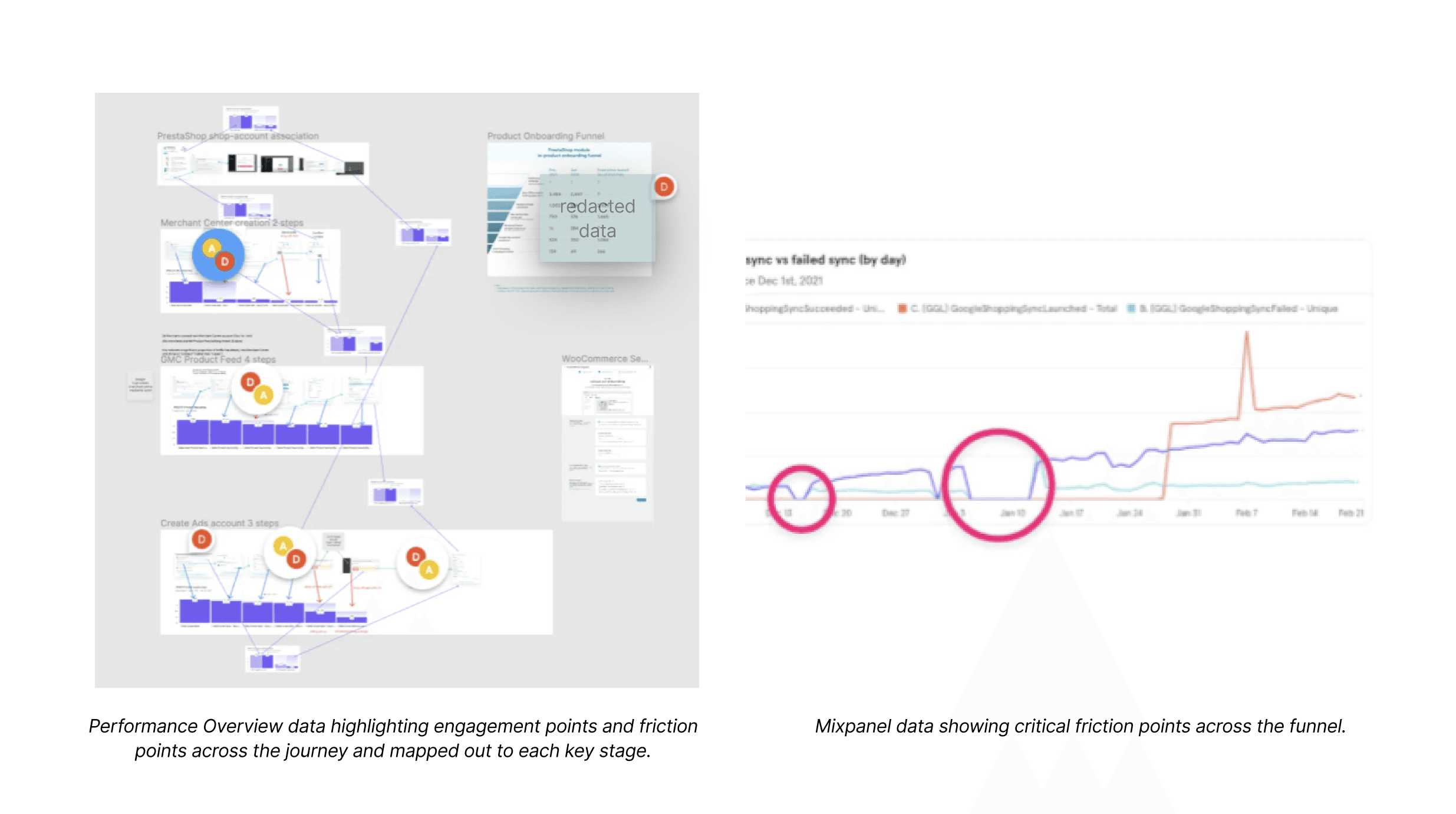
Conducted a full design audit of the existing Prestashop Ads experience. Reviewed usage data (Mixpanel), ran heuristic evaluations, and aligned with engineering teams at Prestashop on implementation limitations.
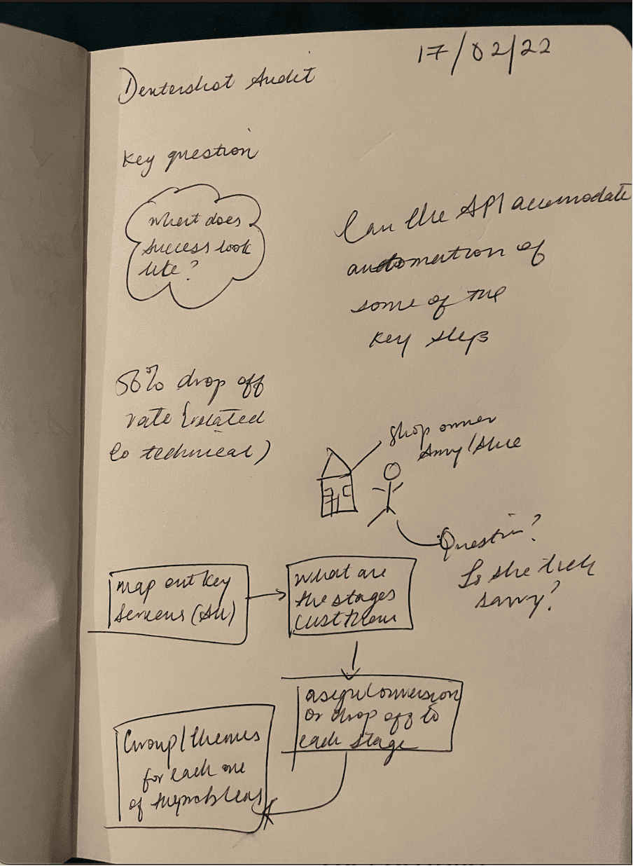
Initial audit notes exploring module friction points and inconsistencies.
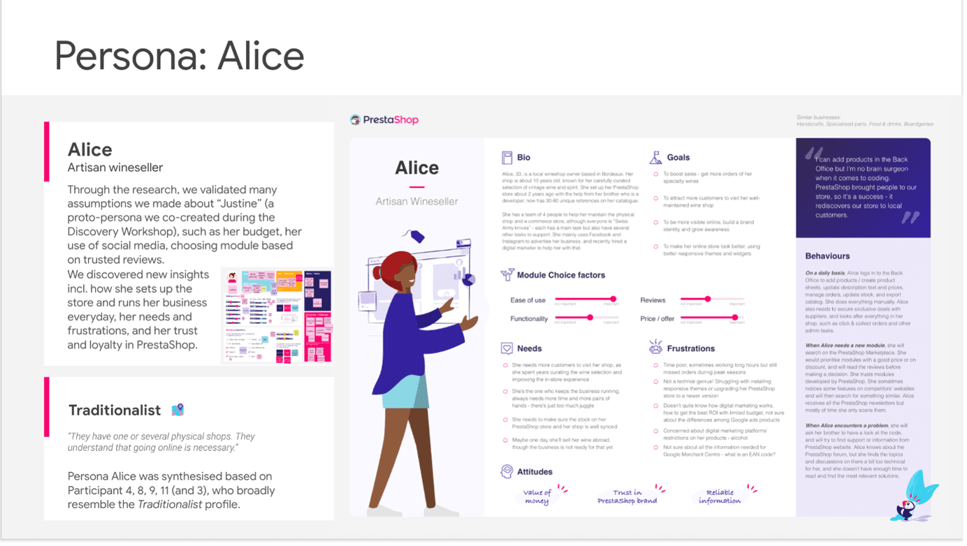
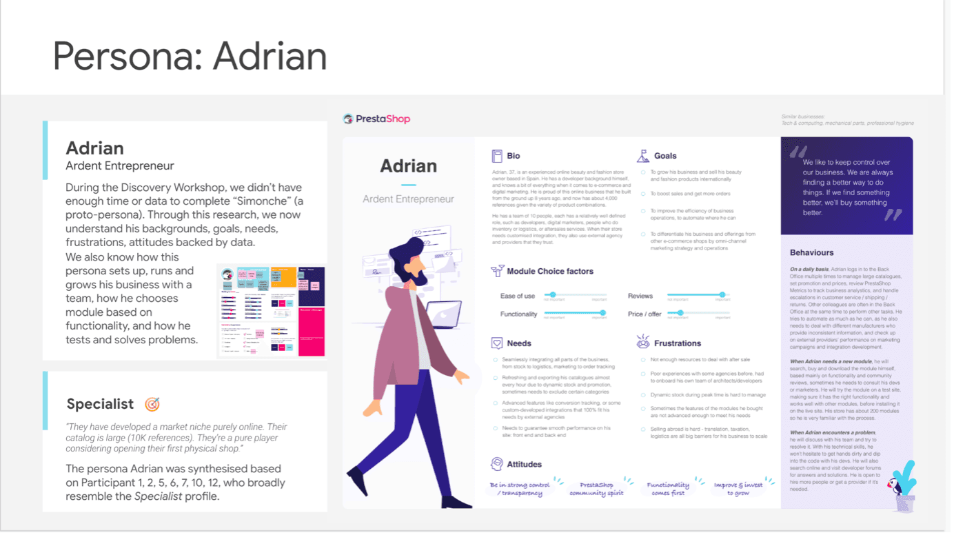
Primary and secondary personas detailing use cases across SMB advertiser profiles
Define
The following discoveries were made following the analysis and sythesis of data from Mixpanel, Customer Support Tickets, Social Listening and user surveys. * 16% of users completed campaign setup * 54% dropped off before reaching budget settings Identified UX bottlenecks: unclear CTAs, poor localisation, shipping info buried in multiple screens, and mismatched Google visual semantics.
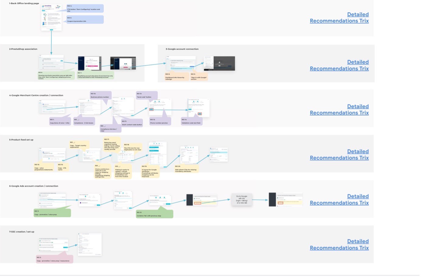
Annotated campaign creation flow highlighting user pain points and drop off points across the campaign creation journey
**Images have been blurred and/or redacted to protect sensitive client information
**Images have been blurred and/or redacted to protect sensitive client information
Ideate
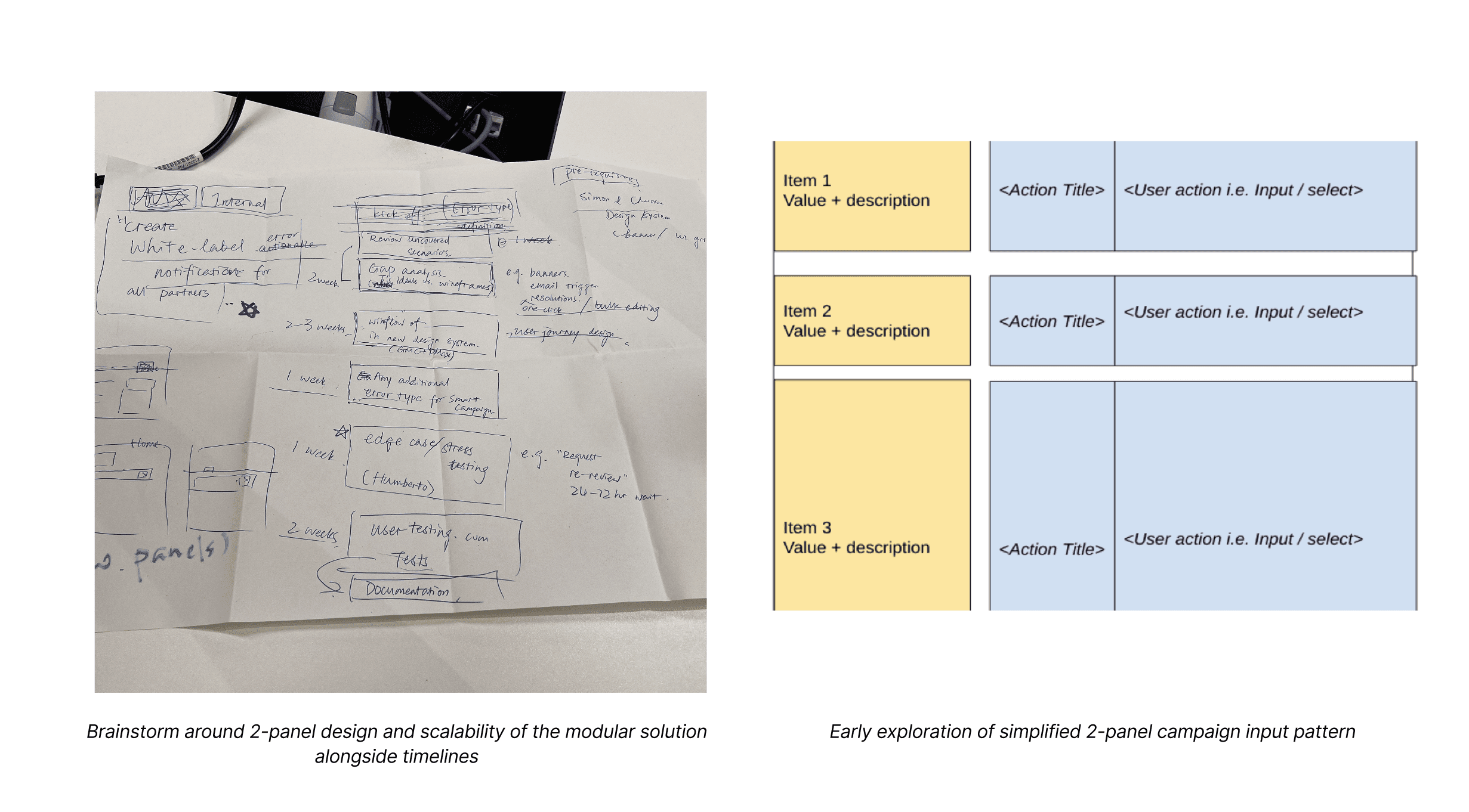
Explored approaches for trust-building, flow reorganisation, clearer labelling, and consistent layouts. Introduced “2-panel” modular UX to simplify campaign input and preview logic.
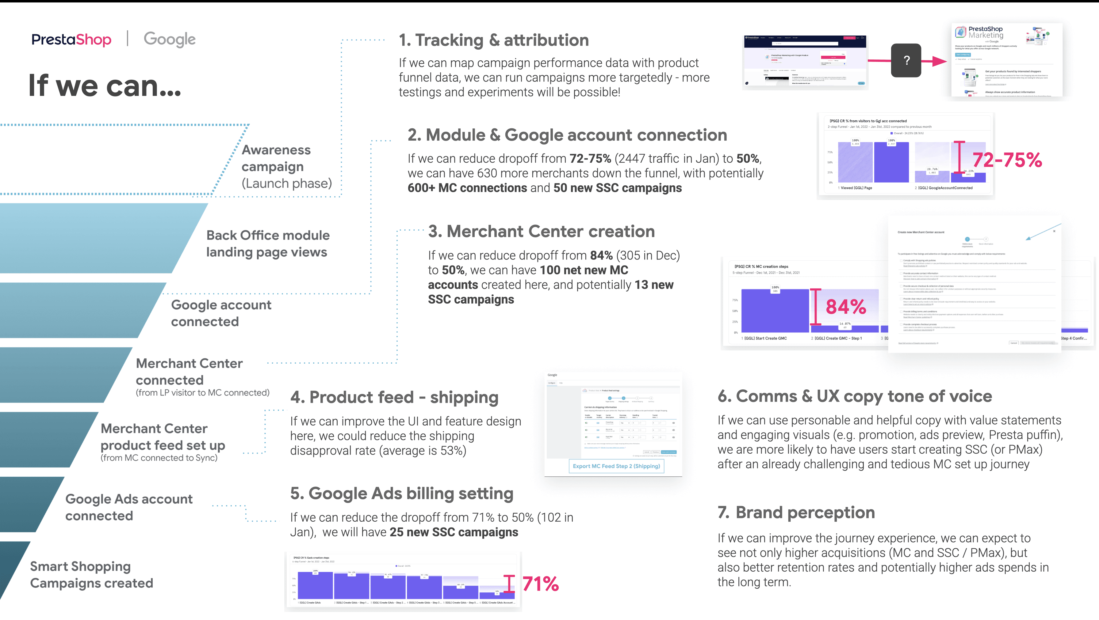
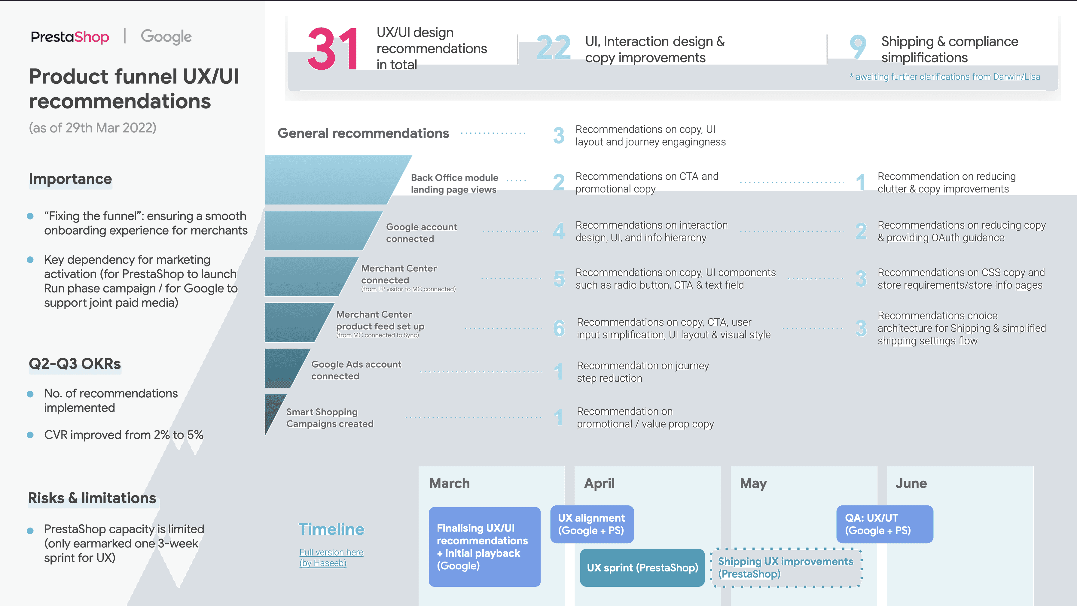
Image showing focus areas and recommendation theming across the funnel
Design
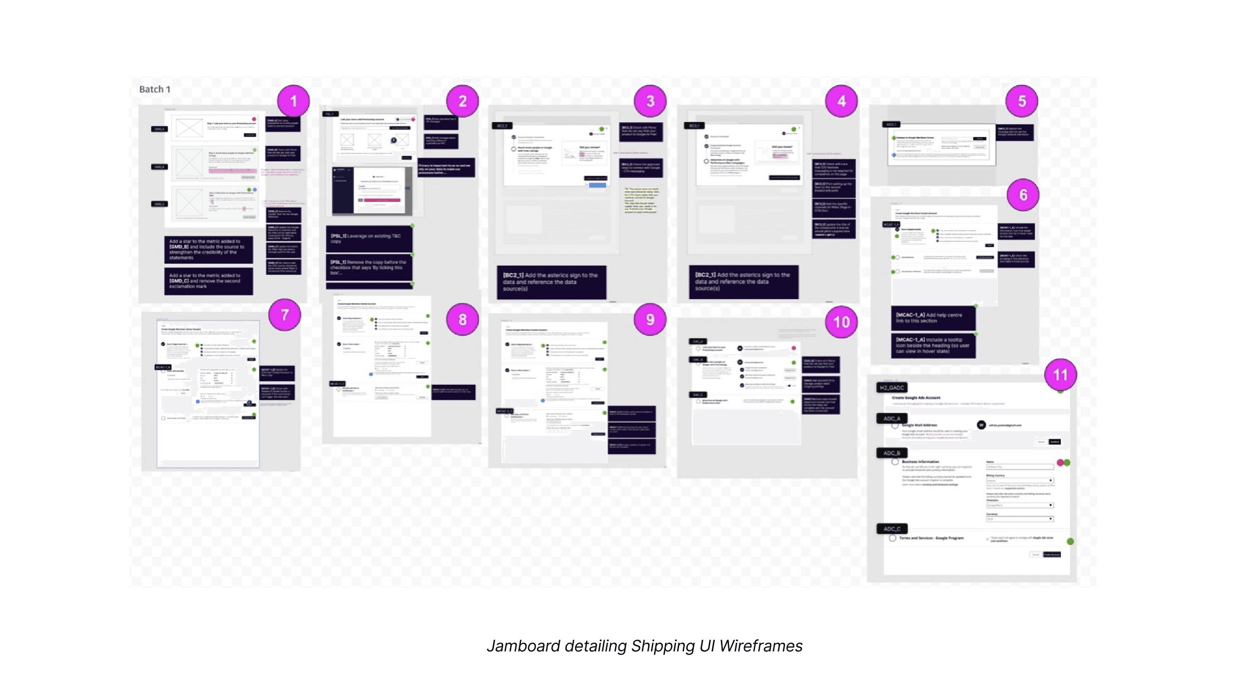
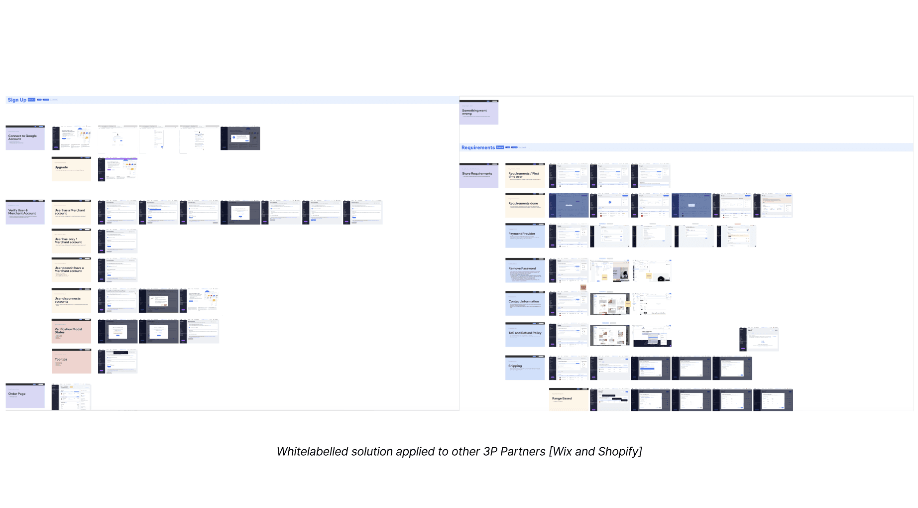
Using Figma, wireframes were designed and prototyped exploring key areas ranging from campaign creation to Google Ads account creation as well as the Shipping UI flow. All these implemented the 3-Step 2 panel framework that was assembled using a modular design system to ensure scalability across board and future proofing the solution such that it can be replicated on other 3P partner platforms and can be used after the Smart Shopping Ads transitioned to Performance Max Ads (PMax)
Key aread of focus were as follows and all designs considered localisation in primary Markets across Europe.
Shipping experience clarity
Localised CTA variants
Asset upload flow
System-matching UI tokens
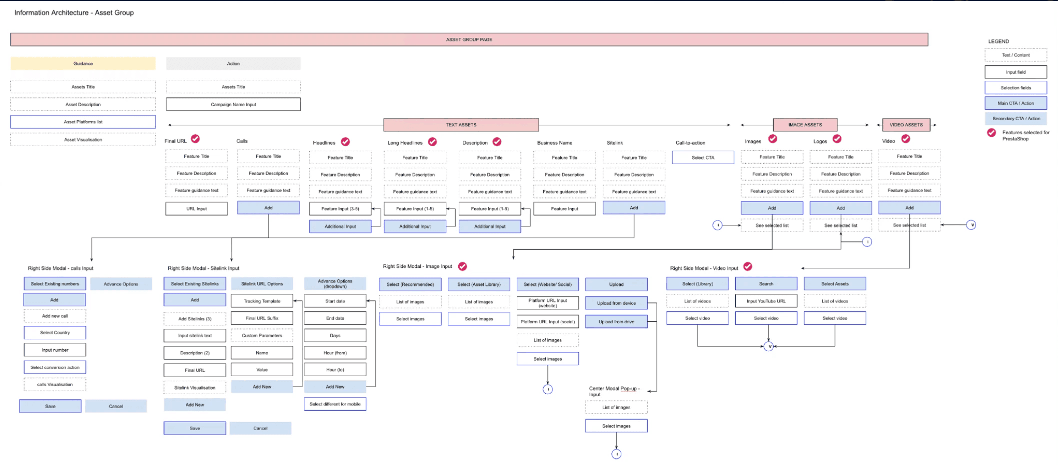
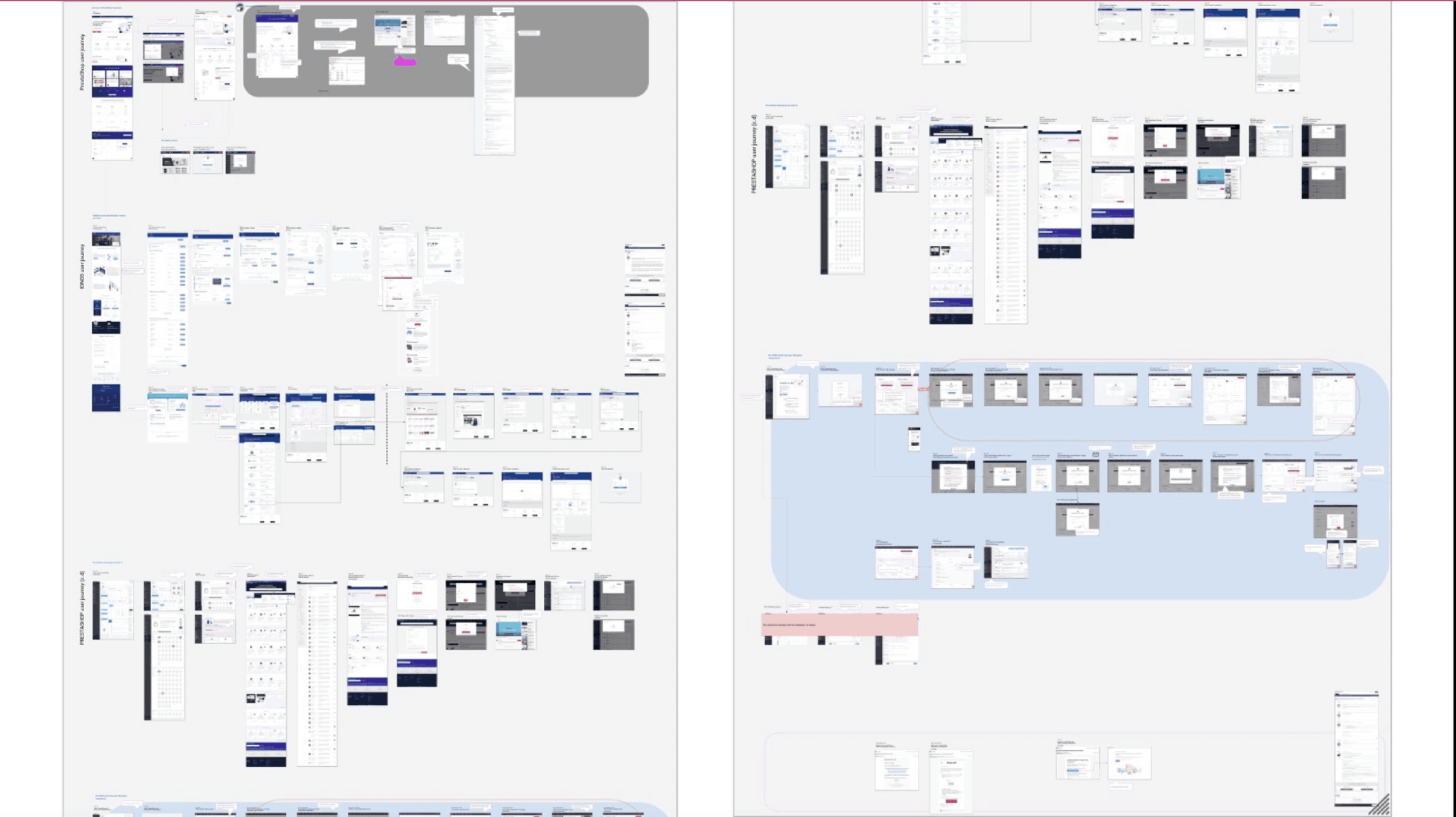
Image showing UI Setup for design of screens across the several flows - including error states and localised content
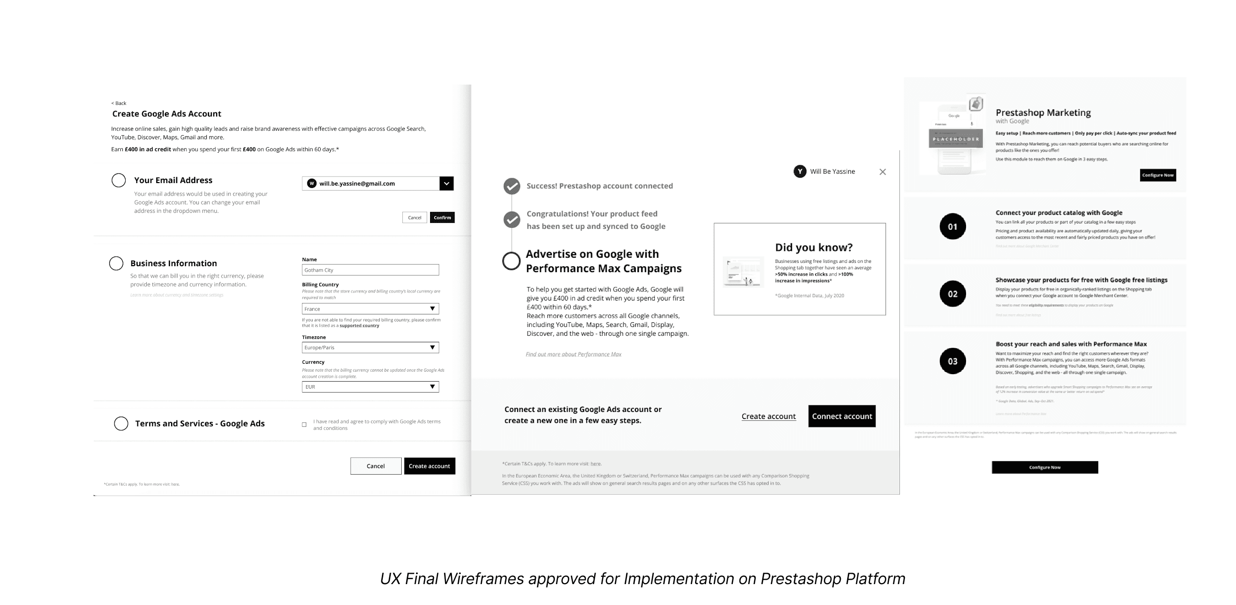
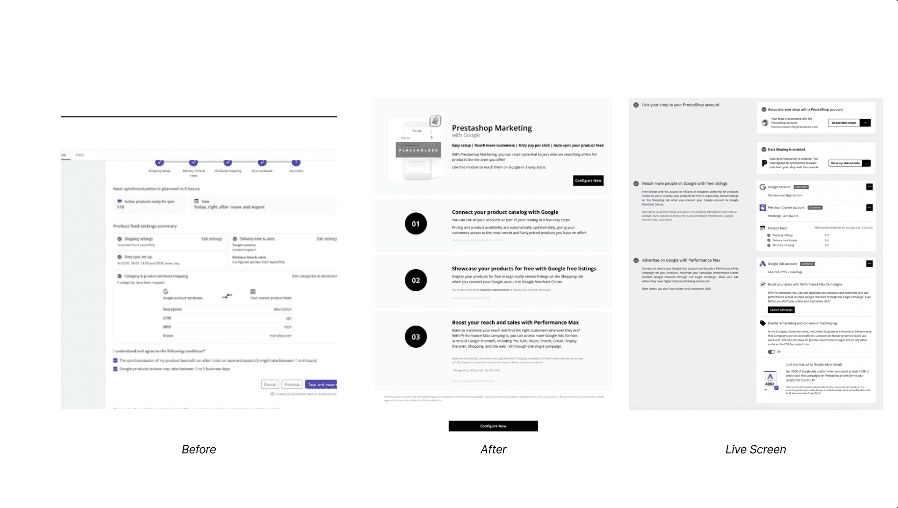
Designs Delivered
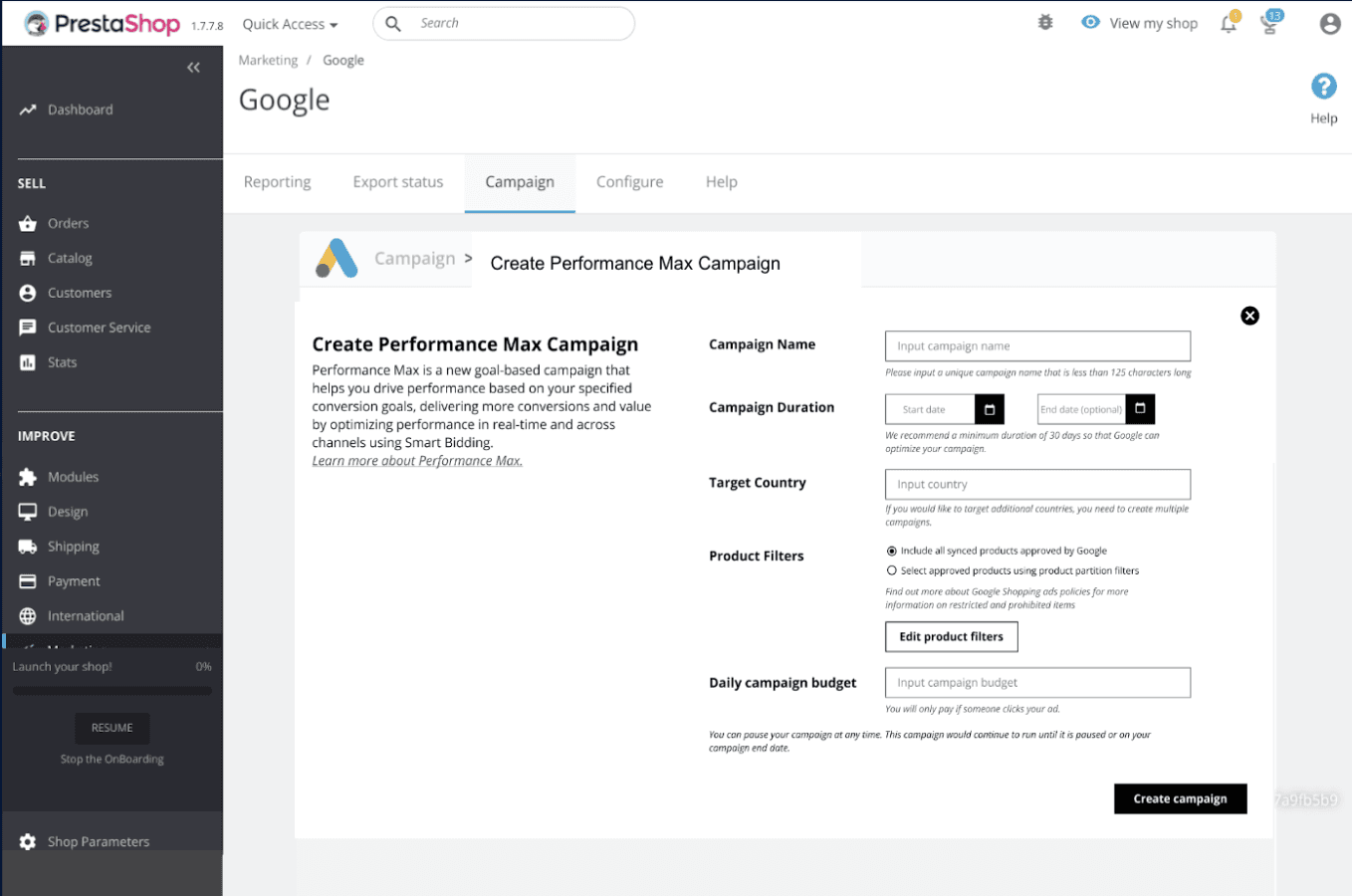
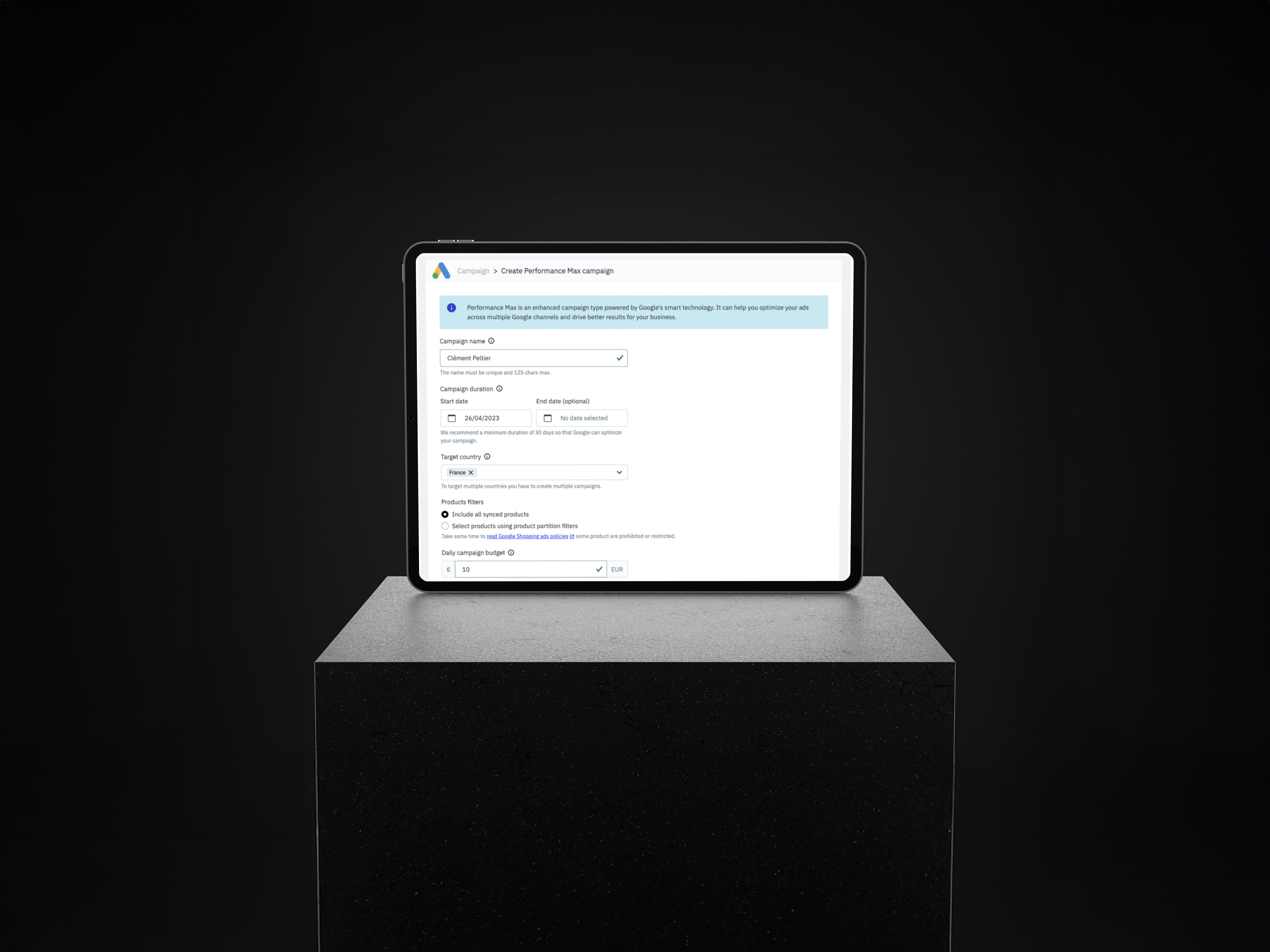
The below screens detail the final UI and interaction for the Google Ads Ad Creation core screens to Prestashop’s design/dev team. These supported implementation with artefacts, annotated hand-offs, and QA reviews.
Testing
Performed iterative testing with Google internal stakeholders and Prestashop users in 3 countries. Refined copy, shipping logic, and button hierarchies based on feedback.
Learnings
Clearer CTAs outperformed clever ones
Localisation is not translation — collaboration with local experts was essential
Modular UX patterns were easiest to scale and A/B test
Design handoff is more successful when systems-level thinking is applied early
Metrics
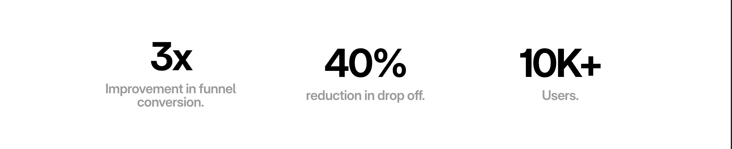
Funnel completion improved from 2% → 6% (3x uplift)
Drop-off reduced by 40%
Localisation alignment implemented across 7 countries
Scaled module now used in Wix and Shopify integrations
Beyond - Scaling the solution
This project was a masterclass in systems thinking, cross-functional collaboration, and balancing user trust with scalable product impact. It exemplified my design philosophy: “Great design scales trust, not just pixels.”
Google - Redesigning the Prestashop Ads Integration Module
Role
Senior Product Designer
Project Duration
UX Strategy
Product Design
Team Structure
Cross-functional: UX (myself), PMs, Engineering, Legal, Localisation, Prestashop External Dev Team, Google Partnership Marketing
Client
Google (Via Accenture Song)
I. Context
Product
The Google Ads Prestashop Integration is a 3rd party e-commerce module that allows SMBs to launch campaigns via Google Ads directly from their Prestashop dashboard.
Objectives & OKRs
Improve campaign creation completion from 16% to 30%
Reduce drop-off rate at setup by 25%
Enhance user clarity and perception of Ads value
Align localisation and legal requirements across EMEA
Create a scalable design system and white-labelled UI for rollout across additional platforms
Problem
Users (mostly SMBs) found the integration confusing, unintuitive, and inconsistent with their expectations of Google products. Internally, this led to weak adoption, high drop-off, and reputation risk for Google’s ecosystem partners. The campaign creation journey was fragmented, unclear, and lacked trust-inspiring UX cues.
II. Process
Strategy & Discovery
My first step was to lead a cross-functional UX audit of the entire campaign creation journey. This included:
Reviewing completion data, funnel analytics, and drop-off points
Auditing support tickets and social listening forums for pain point themes
Mapping the full end-to-end journey (7 key stages, 12 UX themes identified)
Coordinating with language and legal teams to surface compliance blockers
Understand
Conducted a full design audit of the existing Prestashop Ads experience. Reviewed usage data (Mixpanel), ran heuristic evaluations, and aligned with engineering teams at Prestashop on implementation limitations.
Initial audit notes exploring module friction points and inconsistencies.
Primary and secondary personas detailing use cases across SMB advertiser profiles
Define
The following discoveries were made following the analysis and sythesis of data from Mixpanel, Customer Support Tickets, Social Listening and user surveys. * 16% of users completed campaign setup * 54% dropped off before reaching budget settings Identified UX bottlenecks: unclear CTAs, poor localisation, shipping info buried in multiple screens, and mismatched Google visual semantics.
Annotated campaign creation flow highlighting user pain points and drop off points across the campaign creation journey
**Images have been blurred and/or redacted to protect sensitive client information
**Images have been blurred and/or redacted to protect sensitive client information
Ideate
Explored approaches for trust-building, flow reorganisation, clearer labelling, and consistent layouts. Introduced “2-panel” modular UX to simplify campaign input and preview logic.
Image showing focus areas and recommendation theming across the funnel
Design
Using Figma, wireframes were designed and prototyped exploring key areas ranging from campaign creation to Google Ads account creation as well as the Shipping UI flow. All these implemented the 3-Step 2 panel framework that was assembled using a modular design system to ensure scalability across board and future proofing the solution such that it can be replicated on other 3P partner platforms and can be used after the Smart Shopping Ads transitioned to Performance Max Ads (PMax)
Key aread of focus were as follows and all designs considered localisation in primary Markets across Europe.
Shipping experience clarity
Localised CTA variants
Asset upload flow
System-matching UI tokens
Image showing UI Setup for design of screens across the several flows - including error states and localised content
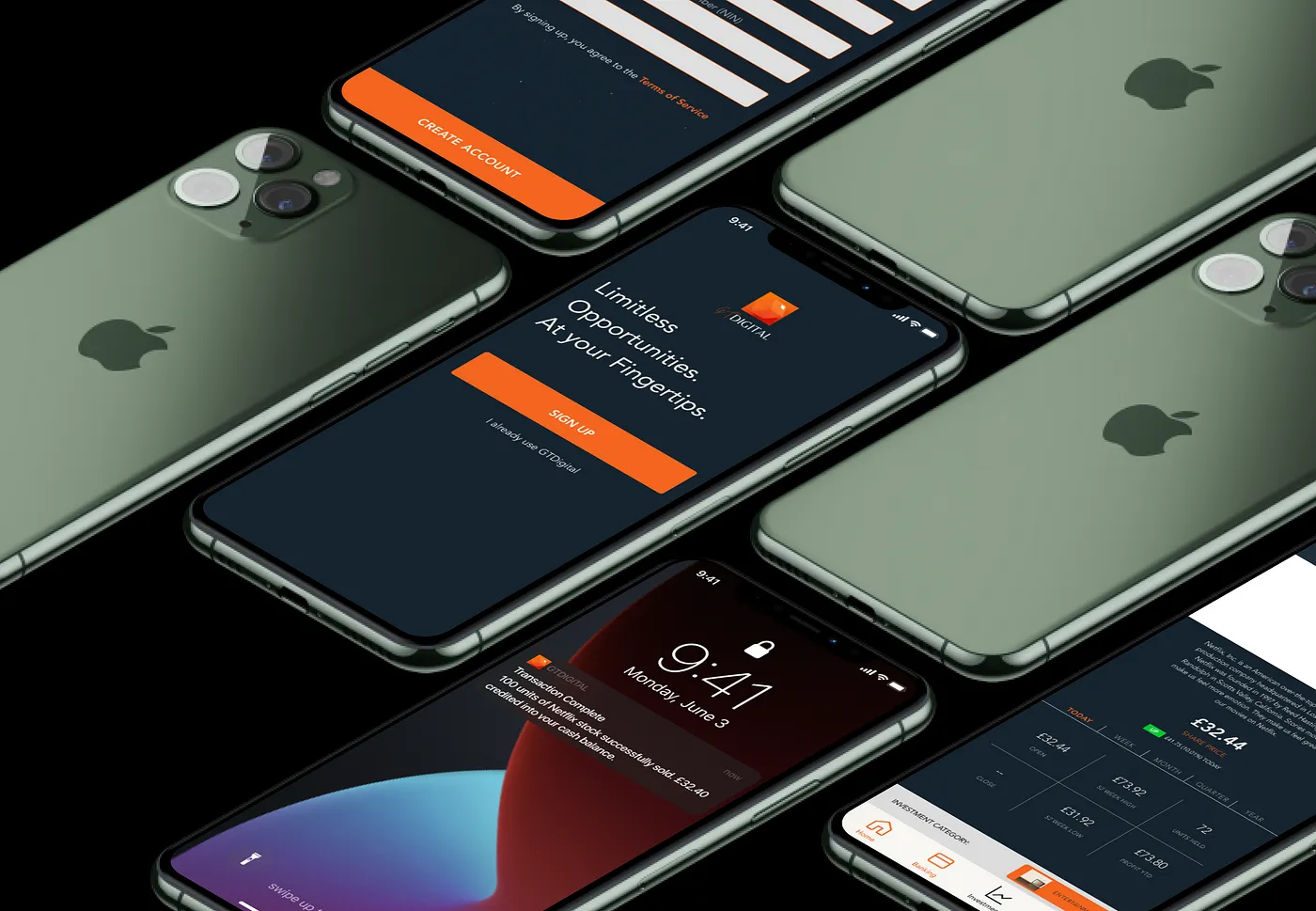
Designs Delivered
The below screens detail the final UI and interaction for the Google Ads Ad Creation core screens to Prestashop’s design/dev team. These supported implementation with artefacts, annotated hand-offs, and QA reviews.
Testing
Performed iterative testing with Google internal stakeholders and Prestashop users in 3 countries. Refined copy, shipping logic, and button hierarchies based on feedback.
Learnings
Clearer CTAs outperformed clever ones
Localisation is not translation — collaboration with local experts was essential
Modular UX patterns were easiest to scale and A/B test
Design handoff is more successful when systems-level thinking is applied early
Metrics
Funnel completion improved from 2% → 6% (3x uplift)
Drop-off reduced by 40%
Localisation alignment implemented across 7 countries
Scaled module now used in Wix and Shopify integrations
Beyond - Scaling the solution
This project was a masterclass in systems thinking, cross-functional collaboration, and balancing user trust with scalable product impact. It exemplified my design philosophy: “Great design scales trust, not just pixels.”
Google - Redesigning the Prestashop Ads Integration Module
Role
Senior Product Designer
Project Duration
UX Strategy
Product Design
Team Structure
Cross-functional: UX (myself), PMs, Engineering, Legal, Localisation, Prestashop External Dev Team, Google Partnership Marketing
Client
Google (Via Accenture Song)
I. Context
Product
The Google Ads Prestashop Integration is a 3rd party e-commerce module that allows SMBs to launch campaigns via Google Ads directly from their Prestashop dashboard.
Objectives & OKRs
Improve campaign creation completion from 16% to 30%
Reduce drop-off rate at setup by 25%
Enhance user clarity and perception of Ads value
Align localisation and legal requirements across EMEA
Create a scalable design system and white-labelled UI for rollout across additional platforms
Problem
Users (mostly SMBs) found the integration confusing, unintuitive, and inconsistent with their expectations of Google products. Internally, this led to weak adoption, high drop-off, and reputation risk for Google’s ecosystem partners. The campaign creation journey was fragmented, unclear, and lacked trust-inspiring UX cues.
II. Process
Strategy & Discovery
My first step was to lead a cross-functional UX audit of the entire campaign creation journey. This included:
Reviewing completion data, funnel analytics, and drop-off points
Auditing support tickets and social listening forums for pain point themes
Mapping the full end-to-end journey (7 key stages, 12 UX themes identified)
Coordinating with language and legal teams to surface compliance blockers
Understand
Conducted a full design audit of the existing Prestashop Ads experience. Reviewed usage data (Mixpanel), ran heuristic evaluations, and aligned with engineering teams at Prestashop on implementation limitations.
Initial audit notes exploring module friction points and inconsistencies.
Primary and secondary personas detailing use cases across SMB advertiser profiles
Define
The following discoveries were made following the analysis and sythesis of data from Mixpanel, Customer Support Tickets, Social Listening and user surveys. * 16% of users completed campaign setup * 54% dropped off before reaching budget settings Identified UX bottlenecks: unclear CTAs, poor localisation, shipping info buried in multiple screens, and mismatched Google visual semantics.
Annotated campaign creation flow highlighting user pain points and drop off points across the campaign creation journey
**Images have been blurred and/or redacted to protect sensitive client information
**Images have been blurred and/or redacted to protect sensitive client information
Ideate
Explored approaches for trust-building, flow reorganisation, clearer labelling, and consistent layouts. Introduced “2-panel” modular UX to simplify campaign input and preview logic.
Image showing focus areas and recommendation theming across the funnel
Design
Using Figma, wireframes were designed and prototyped exploring key areas ranging from campaign creation to Google Ads account creation as well as the Shipping UI flow. All these implemented the 3-Step 2 panel framework that was assembled using a modular design system to ensure scalability across board and future proofing the solution such that it can be replicated on other 3P partner platforms and can be used after the Smart Shopping Ads transitioned to Performance Max Ads (PMax)
Key aread of focus were as follows and all designs considered localisation in primary Markets across Europe.
Shipping experience clarity
Localised CTA variants
Asset upload flow
System-matching UI tokens
Image showing UI Setup for design of screens across the several flows - including error states and localised content
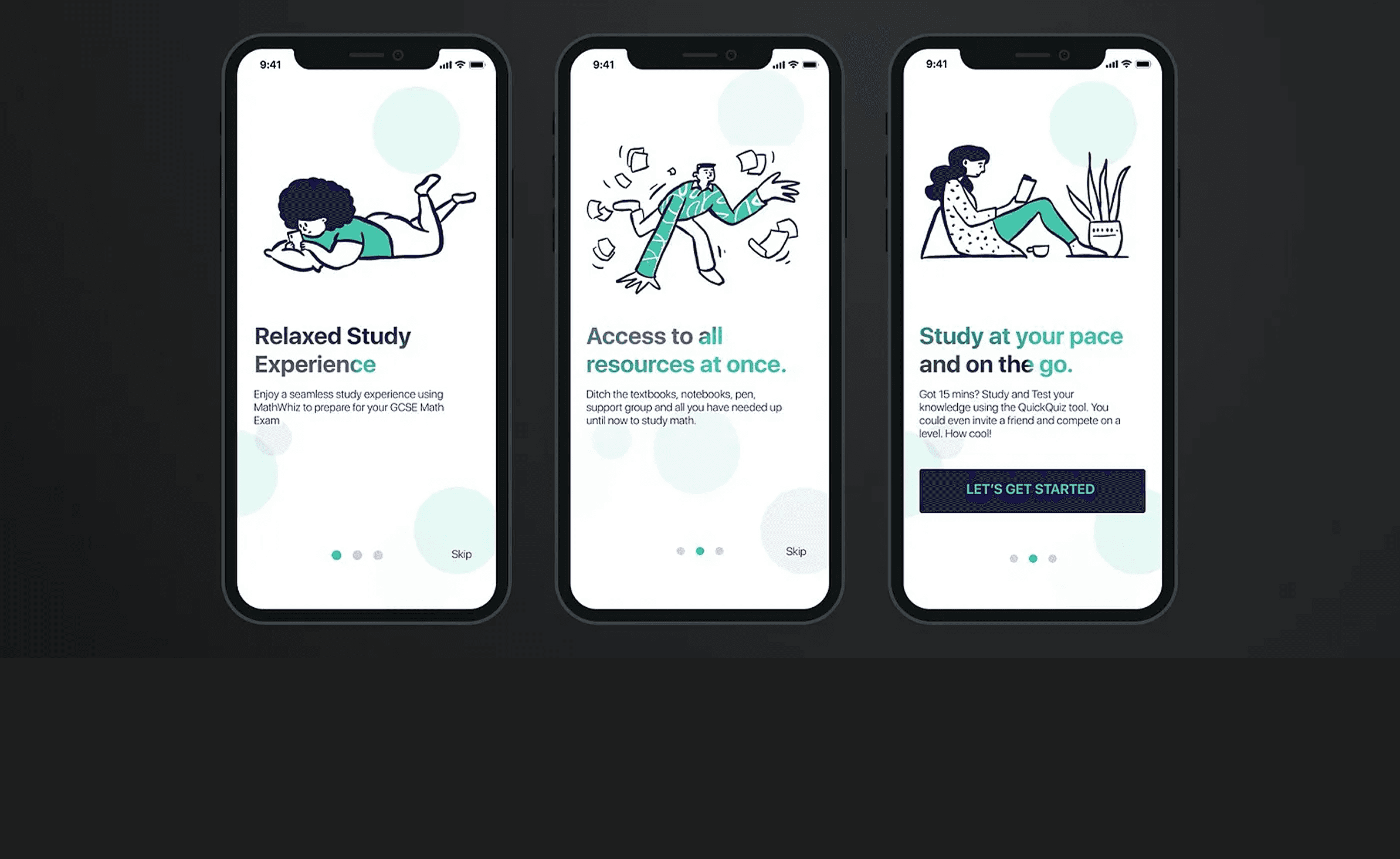
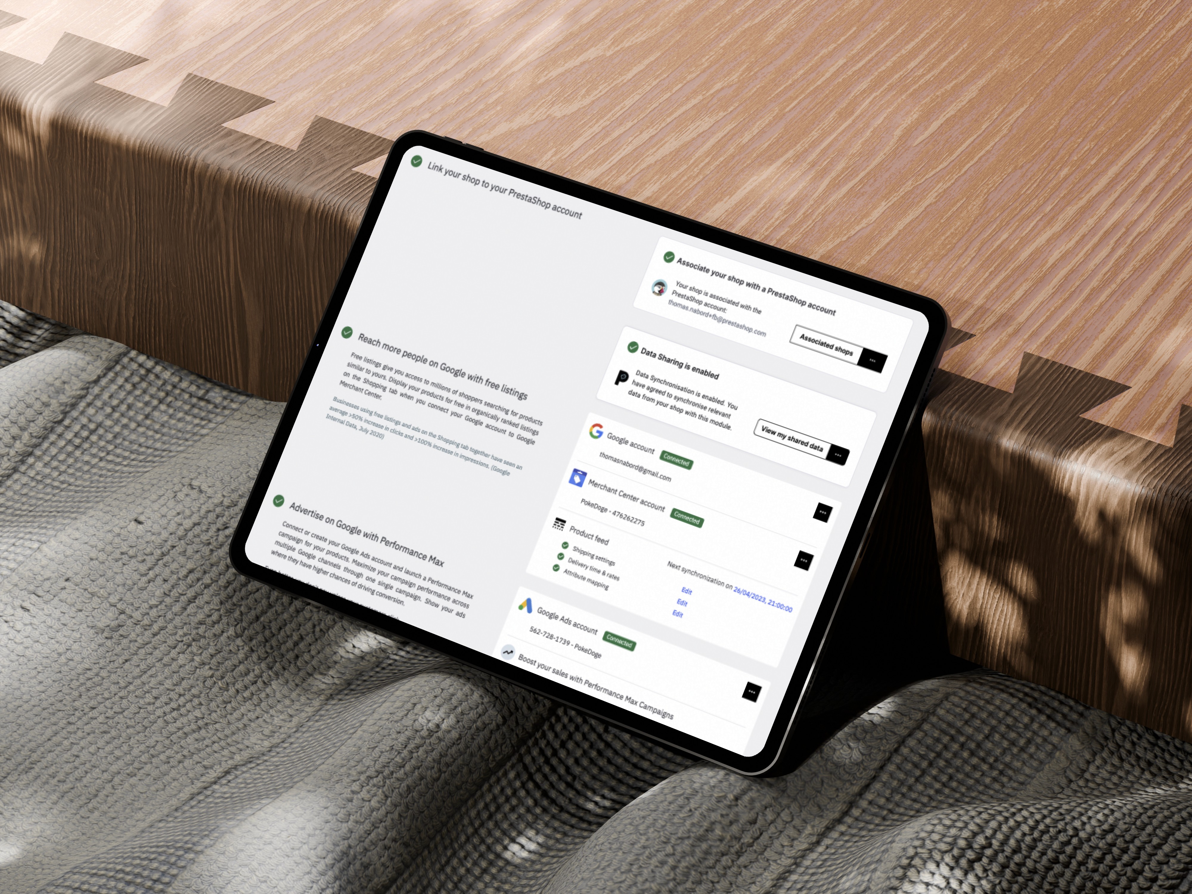
Designs Delivered
The below screens detail the final UI and interaction for the Google Ads Ad Creation core screens to Prestashop’s design/dev team. These supported implementation with artefacts, annotated hand-offs, and QA reviews.
Testing
Performed iterative testing with Google internal stakeholders and Prestashop users in 3 countries. Refined copy, shipping logic, and button hierarchies based on feedback.
Learnings
Clearer CTAs outperformed clever ones
Localisation is not translation — collaboration with local experts was essential
Modular UX patterns were easiest to scale and A/B test
Design handoff is more successful when systems-level thinking is applied early
Metrics
Funnel completion improved from 2% → 6% (3x uplift)
Drop-off reduced by 40%
Localisation alignment implemented across 7 countries
Scaled module now used in Wix and Shopify integrations
Beyond - Scaling the solution
This project was a masterclass in systems thinking, cross-functional collaboration, and balancing user trust with scalable product impact. It exemplified my design philosophy: “Great design scales trust, not just pixels.”